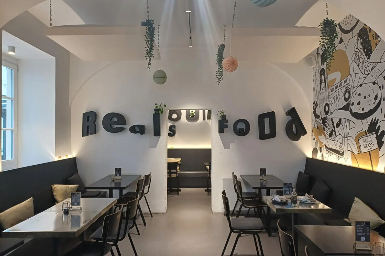
A small restaurant in Vienna has recently found itself in the spotlight—not for its menu, but for its unique interior design. A sign in the internal rooms initially looks like it just reads “Real Food,” but a closer glance reveals that the letters on the wall unintentionally spell out something more R-rated.
The quirky sign, which reads “Real S**t Food” depending on your angle, was captured and shared on Reddit by a sharp-eyed diner who posted it on r/C*****Design with the caption: “Not sure they were paying attention while decorating.”
Online the picture has gained thousands of upvotes and comments, with many assuming that it was a hilarious design mishap. But Wrapstars, the Austrian restaurant behind the decor, is having the last laugh.
Wrapstars co-founder Marko Ertl told Newsweek that the decor is not an accident. “We obviously noticed this before opening the restaurant but thought it would be a funny Easter egg that people would talk about,” Ertl says. “It was an insider joke until now, it seems.”
DoubleTastyMcBacon/Reddit
True to the establishment’s “no-BS” philosophy, Wrapstars prides itself on more than just gimmicky decor. Ertl explained that the restaurant is committed to high-quality food, fair treatment of employees, and integrity across its business practices—a message they’ve backed up with independent certifications. The slogan “Real Food, No BS” is central to their brand ethos, and the cheeky wall arrangement is, in his words, “a visual pun that keeps guests laughing.”
On Reddit, people were super amused by the signage. “Sweet, a restaurant for my dog!” joked Redditor baconmethod. While Ow_wow said: “Seems pretty clear to me. Appreciate their honesty.”
Other commenters were quick to see the funny side: “10/10 no notes,” said one, while another wrote: “I’m sure this was on purpose. Which makes it genius.”
“This is actually pretty cool,” said one Redditor. While one commenter on the post said: “Maybe they’re just honest.”
Although the unconventional sign has stirred up plenty of online attention, Wrapstars has no plans to change it anytime soon. “We might redecorate the whole back room at some point, but as of now, we’re leaving it just as it is,” Ertl said, “It’s become part of our restaurant’s personality.”
This isn’t the first time a printed word mishap has gone viral. Last year Walmart was forced to pull a product from the shelves after a customer pointed out a rude mistake in the T-shirt design.
With the letters “RE” in a large font, the other side features three endings including “cycle,” “use,” “new,” and “think.” But the placement of the words raised some eyebrows as customers realized that the t-shirt had inadvertently spelled out a rude word.
